OMA…Oh My!
Architect: OMA/ Rem Koolhaas
Year Opened: May 2004
Location: Seattle, WA
Square Feet: 362,987 square feet
Height: 185 feet or 56.9 meters high
Introduction/
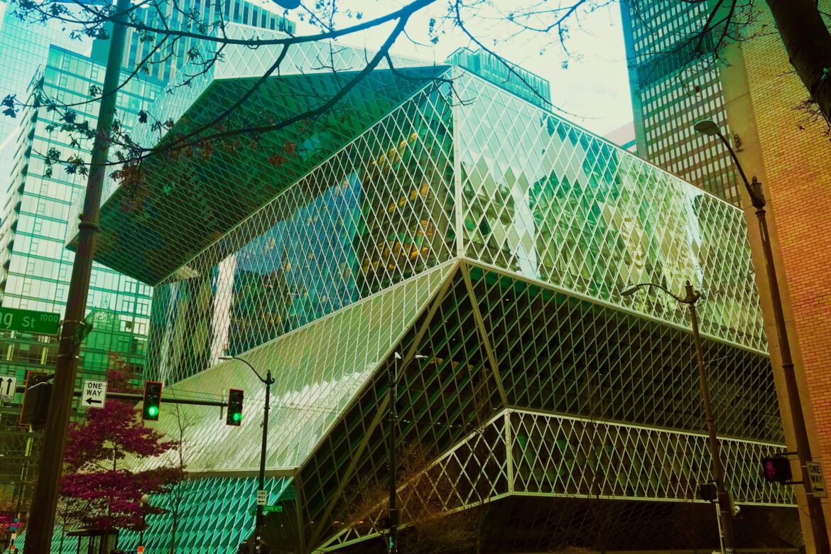
When the Seattle Public Library opened in 2004, it was arguably Seattle’s most conspicuous piece of architecture since the Space Needle. In architecture school, I used Rem Koolhaas’ book, “S,M,L,XL” as inspiration for my big building design. I also used the Seattle Public Library as a precedent for a single-family residence project. Through the Seattle Public Library, OMA/ Rem Koolhaas showcase the “form follows function” mantra, where space develops here and diminishes there to accommodate a specific program. The building’s form, an unusual one, follows in the shape of an extra-terrestrial glass and steel chunk. Anything but a box. The odd angles produce a striking series of views and spaces that reverberate from the inside while the glass which envelopes the building allows for a dazzling play of light.
Concept/
Libraries are civic spaces for the circulation of information in all its media. In tackling the design, the architects had to contemplate the future and perhaps fate of the physical book along with the role of a library itself. With the pace of technology and digitization moving so quickly, would the physical book grow obsolete? And what about the library itself? Are not the visitor populations diminishing, thereby threatening the library with extinction? What if the library now offered the democratic circulation of knowledge in all of its forms, books included? Finally, the proliferation of information in the digital form means that libraries are in the business of curating data and helping patrons sort through the over-abundance of information on the web.
The design offers five programmatic clusters, each space designed for a specific use: parking, staff, meeting, Book Spiral, and headquarters. Each space varies in flexibility, circulation, color palette, structure and MEP. Within the five platforms are four flowing “in between” planes, which include a children’s space, the “living room”, the “Mixing Chamber” and the reading room. Like children’s blocks, the whole program is stacked vertically, then enveloped in a faceted skin of steel and glass. Sited in downtown Seattle, the building takes advantage of various views, including the lovely blue and green of the Puget Sound.
Starting from the bottom, the entrance on Fourth Avenue houses foreign language resources as well as the “Children’s Room”, with its cocoon like coziness. At the Fifth Avenue level, the carpeted “living room” serves as a civic lobby beneath a 50-foot high angled glass wall, with an espresso stand and fiction stacks. The “Mixing Chamber” is an open area, centrally located, where visitors and librarians can interact, encouraging patrons to seek expert advice. From there, visitors are guided up into the innovative organizational system for an organically growing collection – the “Books Spiral”, an uninterrupted zig-zag ramp of shelving contained within a four-story slab, accentuating the unity of knowledge. The four-story ramp allows people to browse through books in a continuous sequence. The “Books Spiral” offers a solution to a challenge this library and many libraries face: the ever-growing collection of physical books and where and how to store them. At the time of the library’s opening, 6,233 bookcases contained 780,000 books. The Books Spiral can grow up to 1,450,000 books without the addition of bookcases.
Finally, the adult reading room, on the top floor, inflates outward towards the sky, with views of the Puget Sound and surrounding mountains.
All of these programmatic spaces are adeptly connected – either through the brightly colored escalators or the gentle ramp up the Books Spiral. The furniture is modern in design and color is used to highlight functionality. Signage designer Bruce Mau developed the communication cues to provide circulation clarity.
The exterior of the Seattle Public Library is a distinctive faceted shape, smart and logical. A structural steel and glass skin unifies the polygonal form and defines the public spaces in-between. The building is made of large slabs of reinforced concrete. Because of the reflective glass skin, the building’s exterior appearance changes with each cloud or shadow or ray of sun that passes.
Each of the eight horizontal layers vary in size to fit its function. There are few columns, which give the impression that a 12-story building ostensibly floats without support. In reality, angled pillars transfer the loads from the extended platforms to the banal parking garage columns below ground.

Criticism/
Obviously, such a building could not please everyone and the criticism, at the time of opening and years since, has been fierce. Buildings like these tend to be provocative, for better or worse, and there are plenty of critics of the steel and glass monster. For Architecture, the adage, “bad press is better than no press” may be true, as the discussion about the library has permeated the city into thinking about the possibilities of architecture and urbanism. And it is true that visiting an architectural masterpiece is not the same as actually using it: many have criticized its user-friendliness. Others complain that the library, which is meant to be a civic hub, welcoming to the entire community, stubbornly folds its arms and turns inward, ignoring the sidewalks and connections to the city. It has been accused of lacking accessibility. Finally, there is the question of whether or not the library would become an overdesigned space for the homeless. When I visited in 2018, it was indeed noticeably occupied by homeless people, a fate many libraries face.
Despite the criticism, it is definitely worth a visit, whether you plan to use the library as intended or merely to admire its architecture. It calls the visitor to the exploration and investigation of its various corners and open spaces. A different perspective unfolds in the various zones and the light delights. It is a space fundamentally designed to meet the programmatic requirements of the Information Age of the 21st century.
Sources:
https://oma.eu/projects/seattle-central-library
https://en.wikiarquitectura.com/building/seattle-public-library/#
https://arcspace.com/feature/seattle-public-library/
http://old.seattletimes.com/pacificnw/2004/0425/cover.html
[ctct form=”673″]

















Leave a Reply